The Art of Being Noticed

Folks in our line of work know that the worst thing someone can say to you isn’t, “I don’t like your sign.” The worst thing they can say is, “What sign?”. When you’re in the business of getting people noticed, antipathy isn’t the enemy…indifference is. As you can imagine, the last thing we would wish for any of our customers is to be nondescript.
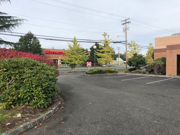
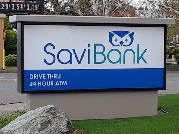
“Nondescript” was pretty much how you would have described the former bank building on Burlington Boulevard — the one next to the west entrance to Fred Meyer. If your first reaction in reading this is, “Wait…what building?”, you know exactly what we’re talking about. Which also means that you may have noticed a recent transformation at that same location. Where a building once stood obscured by shrubbery and painted in a hue that might very well be named, “Amnesia Beige”, there is now a seemingly brand-spanking new structure with an adorable blue owl logo.
Say hello to the latest Savi Bank location…and behold the power of signage!
The “before” and “after” photos in this post are added proof of the old adage, “a picture is worth a thousand words.” But it’s also worth quoting Meyer Sign sales rep Gregg Collins as he recalls this particular signage project — starting with the location itself: “It was a forgotten building that sat on the market for two years before being purchased by Savi Bank. Nobody wanted to buy it.”
The issue, as Meyer Sign saw it, was one of “noticeability” — the commercial real estate equivalent of “curb appeal.” This building clearly lacked it. Say what you will about feng shui, but when the outside of a structure doesn’t even invite the eye, the heart will have no room for inspiration. And while inspiring hearts may seem a lofty vision for a sign company, you have to admit it’s aspirational.
In taking on the design, fabrication, and installation of a comprehensive signage package for the new Savi Bank location, Meyer Sign had to work within some code restrictions that allowed only 32 square feet for a monument display (not very monumental) and the prohibition of “time and temp” signs (so much for an LED display).
Meyer Sign & Advertising was fortunate, however, in having a client partner in the person of Dennis Marrs, Savi Bank’s project manager — a position that keeps Mr. Marrs very busy given the bank’s recently expanding footprint in the Skagit Vally. While Dennis oversaw changes to the building’s landscape and the update of the facade’s color scheme to create a perfect background for the “savvy” blue owl at the visual heart of Savi Bank’s brand.
The result of the Savi Bank/Meyer Sign collaboration was, to quote Gregg Collins, “Such a huge transformation…and not just signage. It’s as though the building didn’t exist before. To make it stand out even more, we added a blue LED tubing border, so when you see it at night it’s just beautiful.”
There is definitely an art to being noticed. Communicating a company’s identity through a display that people will have only a matter of seconds see may not be rocket science, although it might begin to sound like it when you start breaking down all the components that go into the final result. In the art of great signage, however, the return on investment in a high traffic area like Burlington Boulevard is the lowest cost-per-impression advertising you’ll ever experience. All you have to do, as Savi Bank so ably demonstrates, is to make those impressions good ones. And come on now…who can possibly resist that little blue owl?